Emotional Utility Beverage
The science of emotion gets weird in the functional beverage aisle.
Role: Graphic Design
& Art Direction
Responsibilities: Brand standards development, e-commerce, social, field marketing design, and packaging design.

Translating Packaging into the Brand World
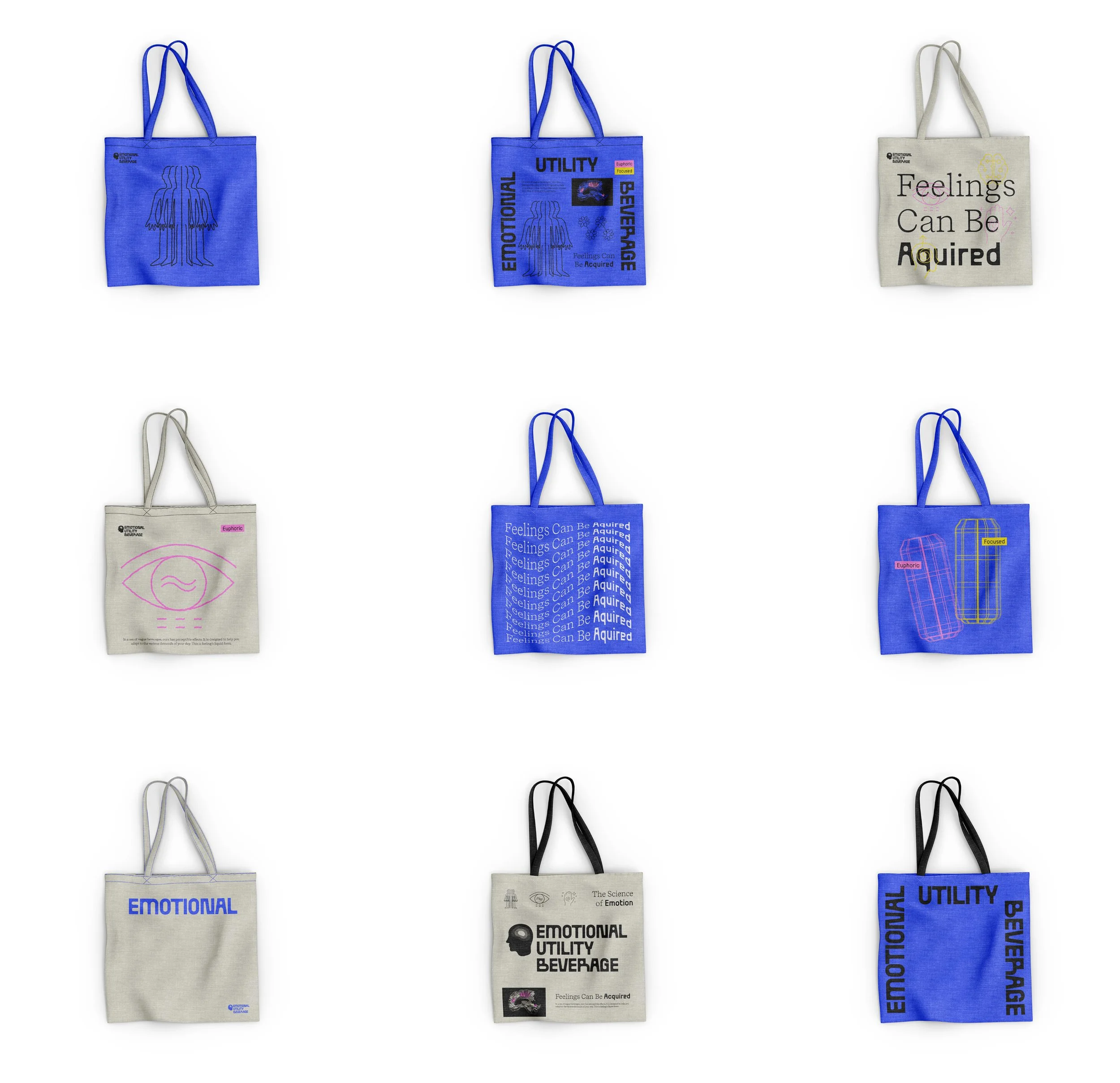
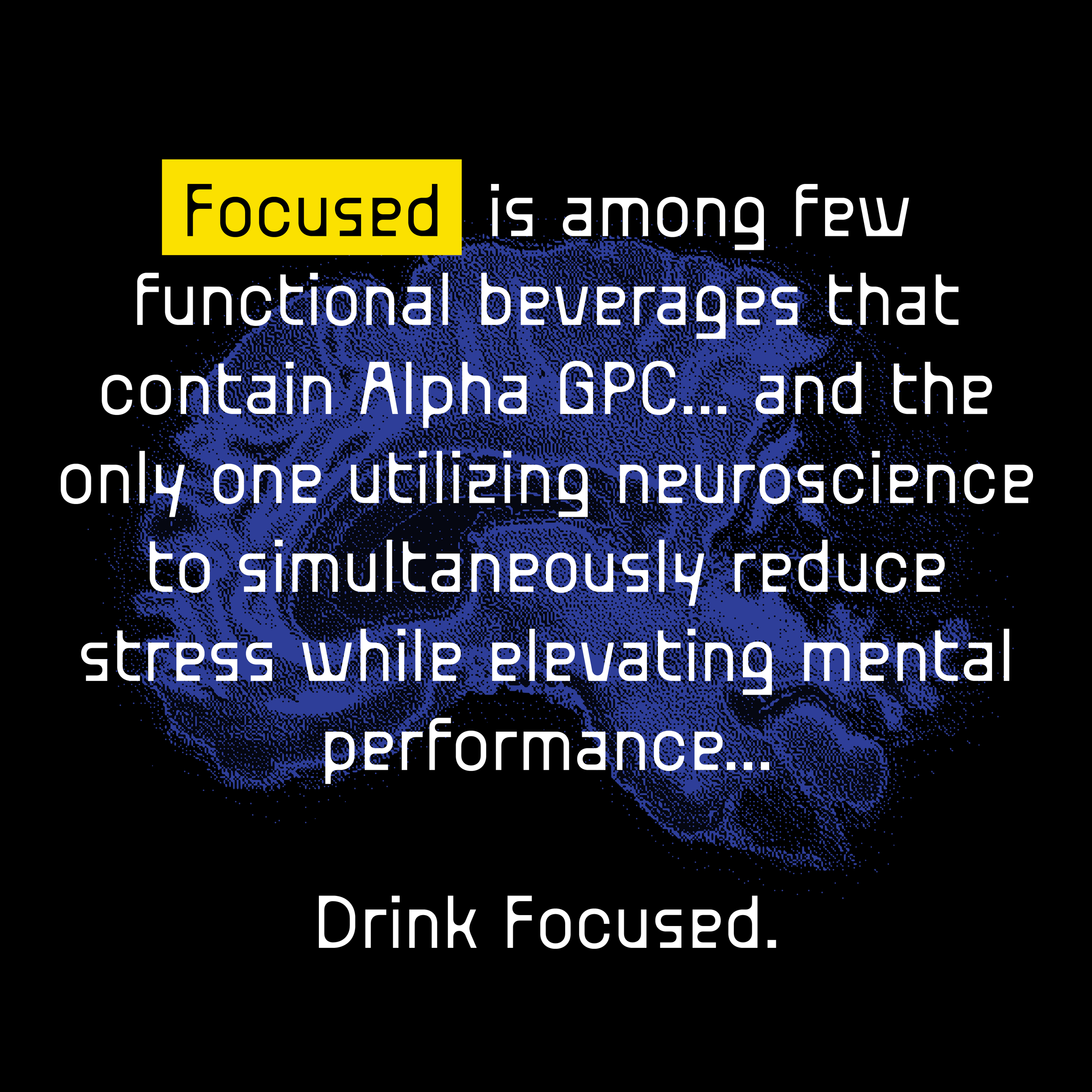
I expanded the new E.U.B. can design into a visual language that powers their broader brand experience—from field marketing to digital, and product photography. This concept wall showcases how crisp typography, brain imagery, and vibrant color cues work together to communicate the product's functional benefits across environments. The system introduces adaptable layout rules and consistent messaging to support mood-boosting storytelling wherever the brand shows up.

Paid ads feature the full product line up along with the functional benefits in rounded Venn Diagram-like bubbles.


Tradeshow.


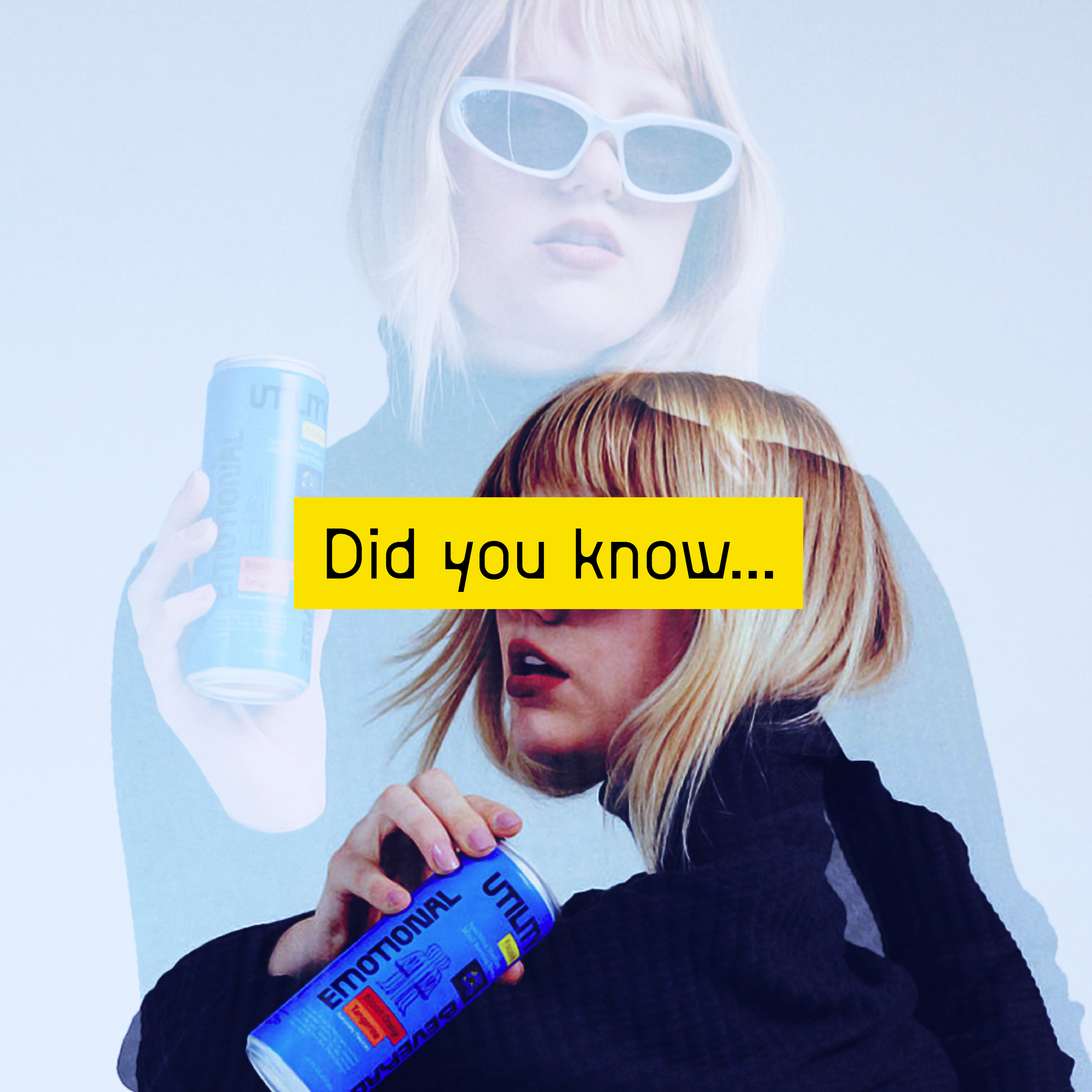
Social


Where the Brand Began
This video features the original E.U.B. branding—built around two separate product lines: Focus and Euphoric. As the brand matured, we consolidated those benefits into a single formula, streamlining both the functional offering and visual identity. While an external partner designed the new can, I led the development of the new design system, aligning the brand’s scientific roots with an emotionally engaging and modern look.
EUB Concept
As part of an expedited request, the company’s leadership team challenged me to redesign the packaging — along side the external agency — leveraging refreshed brand assets to develop a more elevated, consumer-aligned design.
The result is a sleek, neurologically inspired look that bridges science and style while staying true to the original identity.
This concept was the internal favorite among the team, though ultimately not chosen for the rebrand. A strong “maybe next time”—and a proud piece of design thinking under pressure.